Excel + Claude Code skill · Free to use, free to modify
Management reports where the formatting carries meaning
All seventeen IBCS® templates as native Excel charts with live formulas, and as self-contained SVG, on two datasets — the Institute's published example figures and a real insurer's SEC filings.
- Excel
- IBCS®
- Claude Code skill
- SVG
- SEC filings
- Complete setZip · 873 KB · all seventeen templates, every tier — two workbooks, Institute figures and Progressive's, a build guide each
- Simple variantsZip · 309 KB · the seven base-tier templates — two workbooks, Institute figures and Progressive's, a build guide each
- View the project on GitHub (opens in a new tab)The skill itself, the source, and the full history
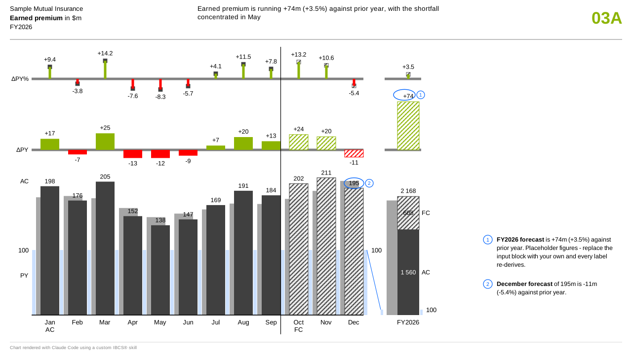
IBCS® is a notation, not a style guide. A solid dark bar is an actual, an outlined bar is a plan, a hatched bar is a forecast, and red means an adverse impact rather than a negative number — so a cost coming in under plan is green even though the number went down. Once a reader knows the notation, they can read a chart they have never seen before without a legend, which is the whole return on adopting it.
 Open the full-size image in a new tab
Template C03A — measure over two variance tiers · synthetic figures 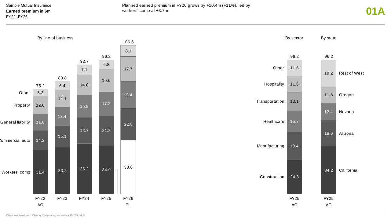 Open the full-size image in a new tab
Template C01A — three panels, one shared scale · synthetic figures  Open the full-size image in a new tab
Template T04A — a statement with its variances drawn · synthetic figures
Detail
This recreates all seventeen templates — thirteen charts and four tables — twice over, from one shared data layer: as native Excel chart objects with live formulas behind every bar, and as self-contained SVG rendered in pure Python with no dependencies at all. Both engines read the same numbers, so the two cannot disagree about what a total is.
Every word a chart shows comes from a cell. Entity, measure, unit, period, reference scenario and the message sentence are six typed inputs, and the text boxes are linked to them — change the cell, the chart re-titles itself.
The hard part turned out to be the axis. Scaling an axis to fit the data means every sheet ends up on its own scale; the fix here is the opposite move — scale the data to a fixed axis, using a hidden span cell per unit group and axis bounds divided by the same span. A test pastes figures a hundred times larger into every sheet and asserts that nothing plots outside its own axis.
One hundred and twenty-seven tie-out checks run before either renderer draws anything. A chart that does not add up does not get made.
Every sheet in these workbooks is live: the shaded cells are typed inputs and everything to the right of them is a formula, so retyping a figure recalculates the variances and redraws the chart, colour included. What ships in those cells is the IBCS® Institute's own published example data — a recreation has to recreate something. Each download carries a second workbook alongside it, the same seventeen templates drawn on The Progressive Corporation's reported figures, for anyone who would rather read the notation against numbers they can go and check. The generated guides walk the same builds by hand in Excel, right down to the hex colours, gap widths and axis bounds, read back out of the workbook after it was written. Each file is a learning tool whether or not you ever run the skill.
In the Progressive workbook every figure is filed, derived or assumed, and the sheet says which. Filed means it appears in an SEC filing or a monthly release; derived means it was computed from filed figures by a rule printed beside it; assumed means the company never published it. Plan and forecast are always assumed, because no public company discloses them — the plan here applies Progressive's own stated 96 combined ratio target to the premium each month actually earned, which is a floor it aims to beat rather than a forecast of what it expects. Assumed cells are shaded blue, footnoted under the data and listed on a Sources tab.
The harvest behind it reconciles to Progressive's own totals in 605 automated checks — among them the state tables in a 10-K, which have to tie to an annual premium figure rebuilt from twelve monthly releases: two documents, filed months apart, that must agree.
It is free to use and free to modify — MIT licensed, with no attribution required. That licence covers this project's code and workbooks; it does not and cannot grant anything in respect of the IBCS® standard or the Institute's own materials.